Designing the Home Tray
BrowserStack · Testing Toolkit • 2 weeks · Sole designer (0→1, E2E)
Impact
- The shipped layout held. No changes to the home tray post-Alpha. Usage data from the first two months validated the categorisation call.
- A 4-tools-card alternative was tested against it, and lost. Discovery suffered when the home tray was replaced. We reverted with data. The home tray as designed is still live today.
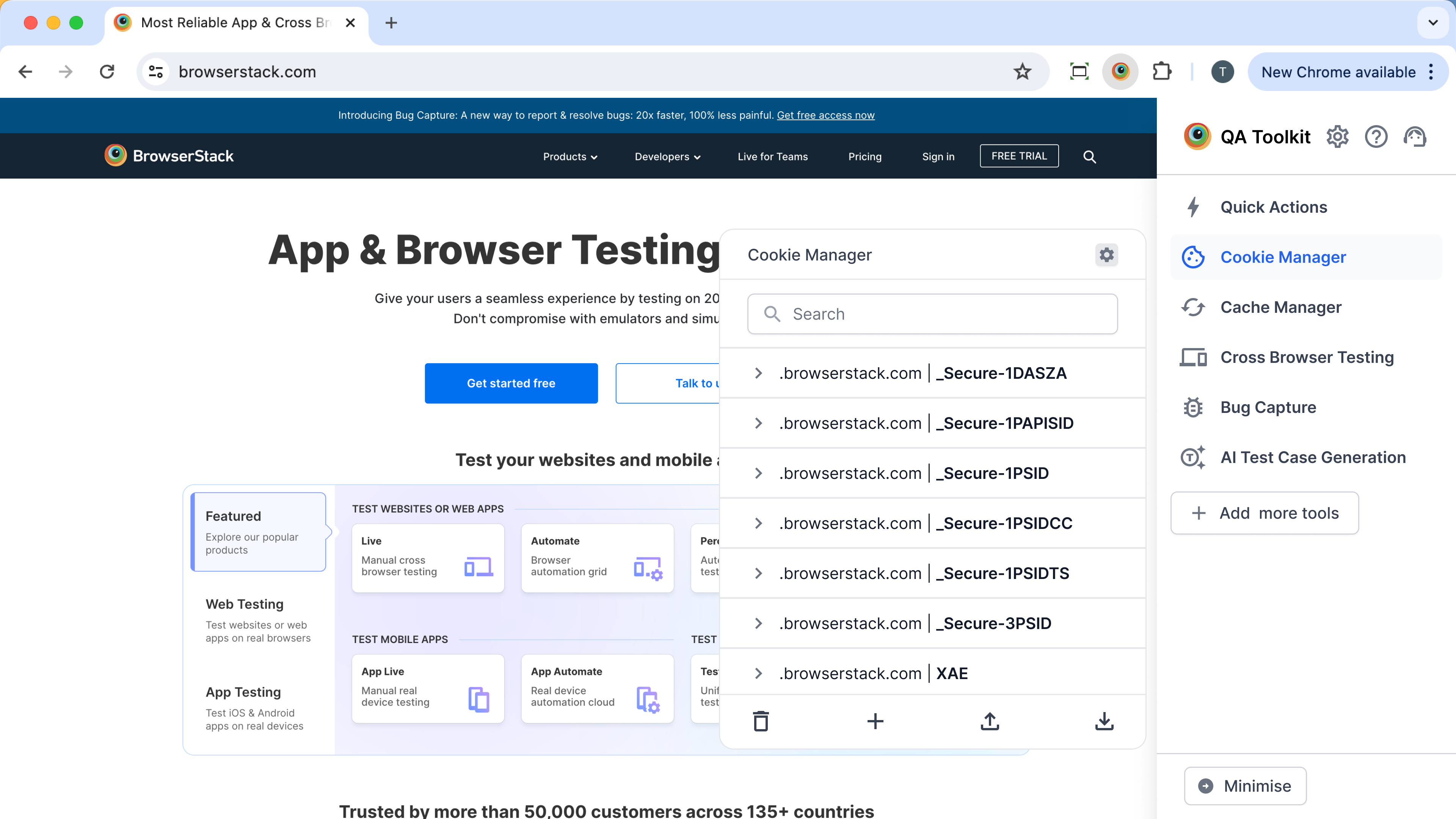
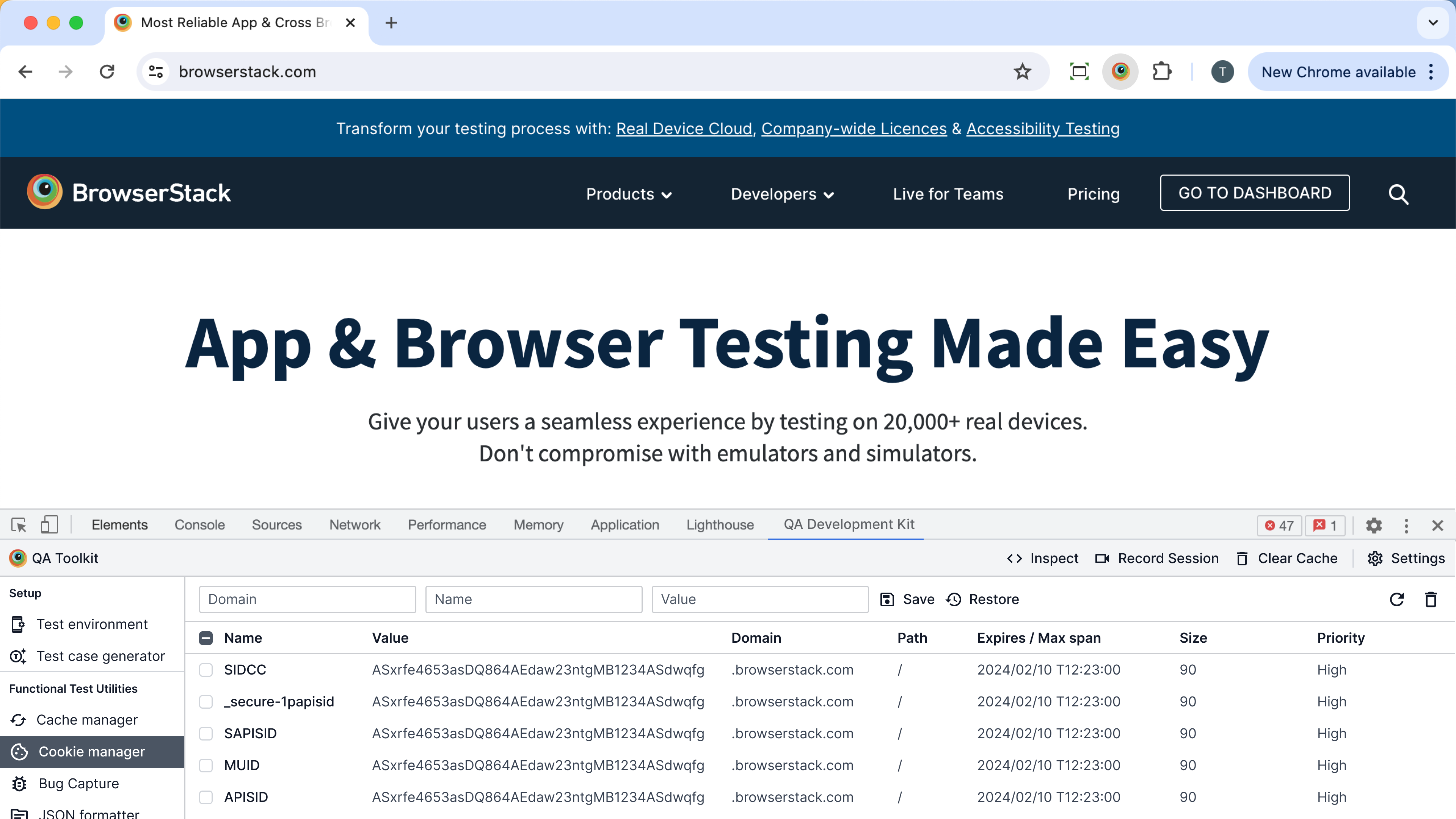
- XS gridlist pattern. Built with Design Stack to fit the 400×600 frame. Now reusable across other extension surfaces.
- 10K+ users met the home tray as their first impression of the toolkit by GA. 20K+ installs in the first year.
- On-time Alpha, despite reframing the layout direction (personalisation to categorisation) mid-sprint.
- Rising Star award (June 2025) for the toolkit work this surface anchored.
The stakes
BrowserStack Live had a retention problem. Low usage frequency, churn at the edges. The Testing Toolkit was a bet on three things at once:
- Drive daily usage of BrowserStack with utilities QAs need every day.
- Be a fast entry point to Live and other BrowserStack products via shortcuts, so users can collapse a multi-step path into one click.
- Open up a new market segment of QAs who don't touch Live today.
The business problem the home tray had to solve
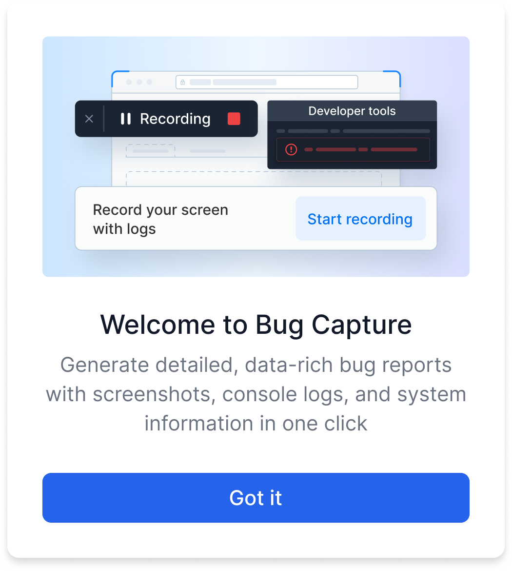
A new product lives or dies on the first session. Acquisition gets a user to install; activation is whether they find value before they close the tab; retention is whether they come back. The home tray is the activation surface. It's the first thing a user sees when the extension opens, and it decides whether they stay.
The specific risk: the toolkit had a lot of tools, and a wall of tools overwhelms. A new user who opens the extension and sees too much at once doesn't feel "this is powerful," they feel "this is a lot," and they drop off. We needed the opposite reaction. The user should open the extension and feel they'd found a home for their QA testing needs — one place, organised, theirs.
So the home tray had two jobs at once: show enough that the product feels substantial and worth returning to, without showing so much that a first-time user bounces. Get that balance wrong in either direction and the activation step fails. And because this was a new product with high internal expectations, failing activation meant failing the whole three-way bet above.
The home tray is the first surface a user sees when the extension opens. It sets expectations, drives discovery of every tool inside, and decides whether the user returns tomorrow. If the home tray fails, the toolkit fails.
Two weeks to land it.
How I ran the two weeks
Treating this as "design a layout" would have run out the clock. I ran it as a sprint with explicit risk ordering: de-risk the layout call first (it locks everything downstream), then parallelise everything that didn't depend on it.
- Week 1, convergence. Five layout directions down to one. Internal QA validation in parallel. Alignment with PM and Eng on which 6 of 10 tools could ship.
- Week 2, spec, build, polish. Component extension with Design Stack. Copy with Marketing. Icon decision (ship with placeholder, real icons follow). Launch QA.
- What I de-risked first: the layout. Everything else (copy, icons, tool order) could shift right up to launch. The layout could not.
- What I parallelised: copy with Marketing, icon work with Visual Design, component build with Design Stack, tool selection with Eng. All of it kicked off the moment the layout direction was locked.
- What I deferred deliberately, not accidentally: quick actions, personalisation, tool descriptions. Each had a reason, and a sequenced home in a future release. Not "out of scope," but "not now, and here's when."
The constraints I walked into
Six conditions shaped the two weeks. I sized each early and chose what to fight vs. accept.
- A Chrome extension popup is a tight frame, roughly 400×600px. Accepted. Density and hierarchy had to do the work that whitespace usually does.
- Alpha had to ship on March 31 to hit the Chrome Store launch window. Accepted. Every scope decision rolled up to this.
- Engineering capacity capped Alpha at 6 tools, not 10. Accepted, sequenced. The other 4 moved into a Coming Soon section.
- New product, no usage data. Worked around. No telemetry to lean on, so concept validation had to come from somewhere (see the QA reroute below).
- Five cross-functional teams to align: Product, Engineering, Design Stack, Marketing, Visual Design. Accepted as the job. Lead work is mostly orchestration.
- External user testing fell through. Fought. The plan was external QA recruitment, and recruitment didn't land in time. I refused to ship without signal and rerouted to internal QAs (more on this below).
The hard calls I owned
Five calls shaped this Alpha. Each one had a clear argument, a moment it flipped (or didn't), a cost, and a win.
1. Categorisation over personalisation
Four directions explored, one shipped. Click any to expand.
The argument I came in with. The brief was always "25+ tools at scale." With a list that long, surfacing only the tools a user actually touches is the right call. Personalisation reduces visual load, raises perceived speed, and rewards repeat use.
What flipped me. Alpha capped at 5–6 tools because of Eng capacity. At that count, personalisation is a worse experience. The "all tools" list is already short enough to scan, and curating from 5 is a cost (a setting to configure) without a benefit (nothing meaningful to hide).
The cost. I shipped a layout I wouldn't have shipped at scale. My argument for personalisation got deferred. It didn't die, but it lost the launch slot.
The win. Shipping on time with a layout that matched the MVP's actual reality, not its someday-state. Categorisation also turned out to be the right pattern for discovery, which, with no usage data and a new audience, was the more pressing problem than efficiency.
The precedent. Categorisation is now the default home tray pattern for extension surfaces in the toolkit. Personalisation has a sequenced home post-15 tools (we're approaching that threshold now).
2. Refusing to ship without user signal
The proposal on the table. External QA recruitment had fallen through. The fastest path was to ship without concept validation and read the Chrome Store reviews after launch.
Why I pushed back. A 0→1 surface that decides retention shouldn't be a guess. And we worked at a QA company. We had hundreds of QAs on staff, the literal target user.
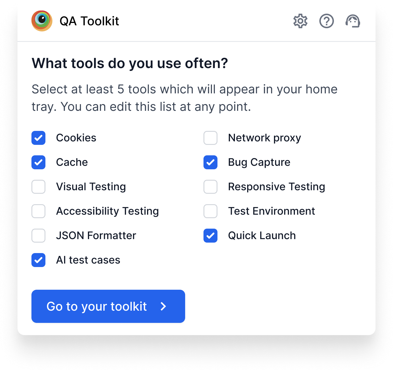
The reroute. I scoped a 5-day internal QA validation: 8 QAs across teams, three layout directions to react to, two specific questions (would you open this, can you find tool X). Not a substitute for external recruitment, but a defensible signal at MVP stage.
The caveats I held. Internal bias was real. These were people who knew BrowserStack. I caveated every read of the data in design reviews ("internal signal, external validation pending Alpha"). The point was to have a signal to caveat, not to pretend it was external data.
The cost. Slower than just shipping. The QA recruitment for external users had to be lined up properly the next time, and I owned that follow-up.
The win. A defensible layout call going into a launch with no usage data. And a reusable internal-QA validation pattern for the next 0→1 surface in the toolkit.
3. Cutting quick actions from the home tray
What I came in convinced of. Quick actions and frequent tools belong on the home tray. Let users perform top actions one click in, without entering each tool. It's the kind of detail that makes a power user a daily user.
The feedback that flipped me. From internal QAs: for users just discovering this product, surfacing actions next to tools created too much going on. The home tray needed to do one job well at this stage (discovery), and adding quick actions made it do two jobs poorly.
The sequencing I proposed instead. Discovery first. Quick actions in a future release, once users know what's in the toolkit and have a mental model of which tools they reach for. The pattern itself is still right. The launch slot is wrong.
The cost. A feature I believed in stayed in the drawer.
The win. A home tray that clears its primary job. And a sharper instinct that "good idea" + "wrong moment" = "wrong idea, today."
4. Extending the gridlist instead of building new
Why I didn't build new. Design Stack already had a gridlist component used elsewhere in the product. It wasn't a perfect fit for an extension's pixel budget, but every minute spent designing a bespoke component was a minute not spent on the Alpha.
What I worked with Design Stack to extend. Tighter spacing, smaller iconography, denser hit targets, two-column variant. All rolled into a new XS size of the existing component, with the variants and tokens owned by Design Stack.
The XS pattern that emerged. The XS scale is now the canonical size for extension surfaces, usable beyond this project for any future popup, sidebar, or constrained surface.
The cost. A few rounds of negotiation with Design Stack on which variants were system-worthy vs. one-off. Slower than just sketching my own.
The win. Roughly two weeks of build time saved on Alpha. A pattern that outlives this project. And a stronger working relationship with Design Stack going into future extension work.
5. Sequencing 6 of 10 tools, parking 4 in Coming Soon
Why 6, not 10. Engineering capacity. The conversation wasn't "should we cut?" but "which 6 keep the product story whole?"
How I chose which 6. Three criteria, in order:
- Coverage of the daily QA workflow: at least one tool per common need (data inspection, network, viewport, capture).
- UI pattern reuse: tools that shared component patterns with each other so Eng could ship 2-for-1 where possible.
- Standalone usefulness: each tool had to be valuable without the others. No tool waiting on a future tool to make sense.
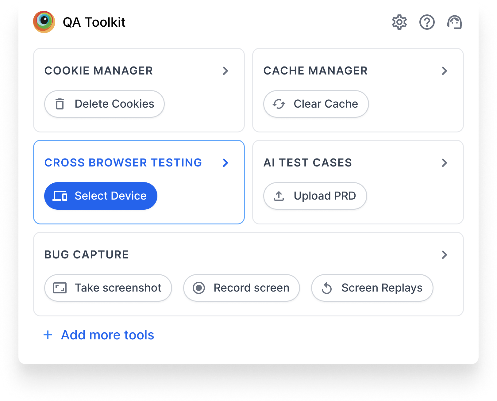
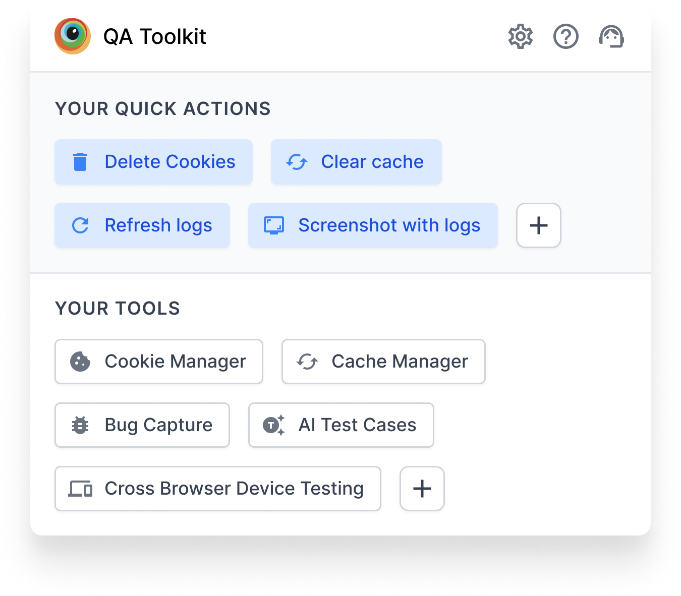
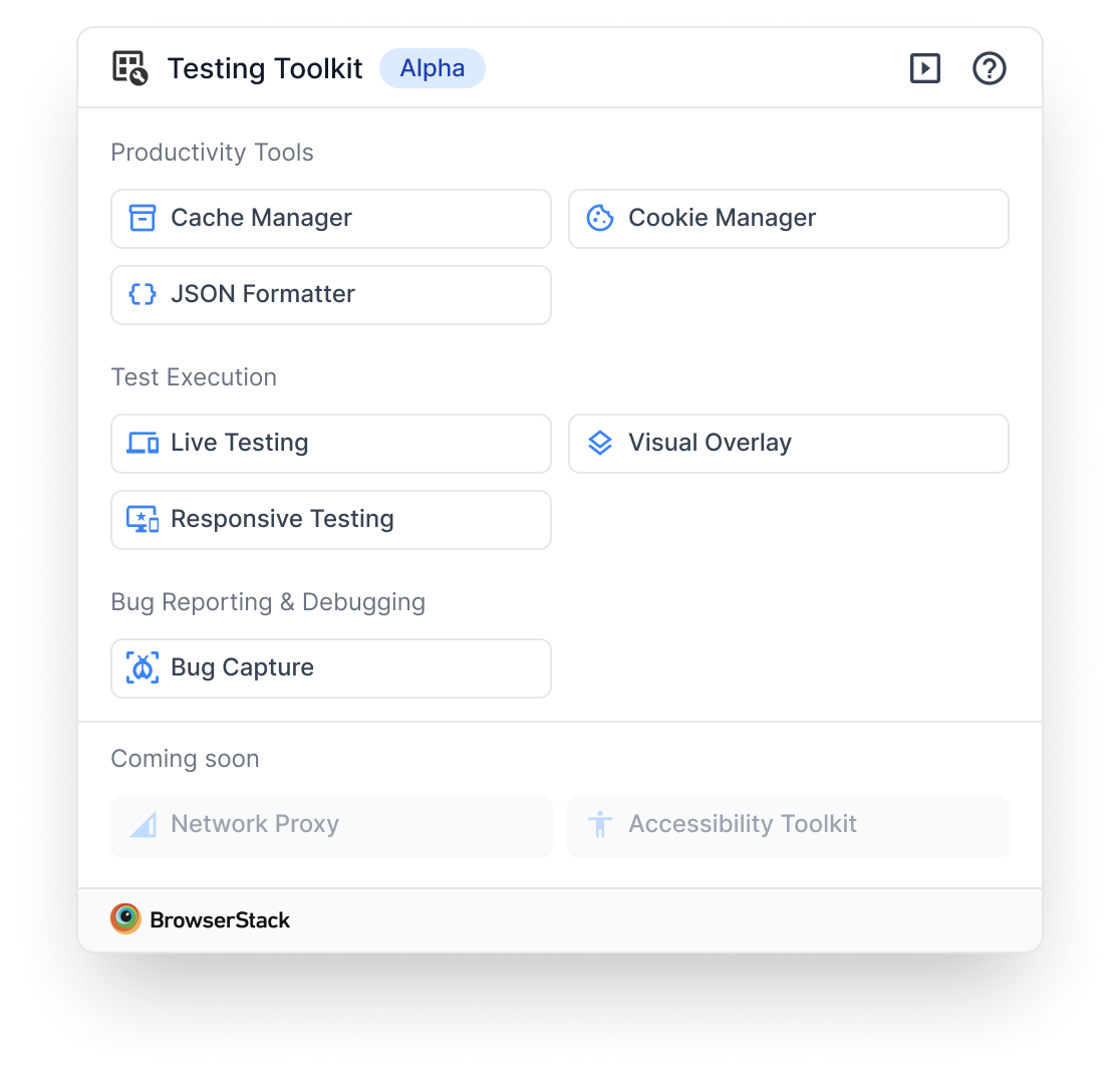
The 6: Cookie Manager, Cache Manager, JSON Formatter, Visual Overlay, Responsive Testing, and QLE (Bug Capture).
Why a visible Coming Soon section, not a hidden one. Hiding the other 4 risked making the toolkit feel thin. Showing them, even disabled, signalled momentum, set up the next release, and let users know if their tool was coming. The risk was vaporware vibes. I mitigated by tying each row to a rough release window in copy.
The cost. Four tools' worth of users (people who came for, say, the colour picker that wasn't in the 6) had to wait. A small portion of Day-1 reviews flagged the absence.
The win. A toolkit that felt fuller than 6 tools, on a release that shipped on time, with a built-in marketing surface for the next four releases.
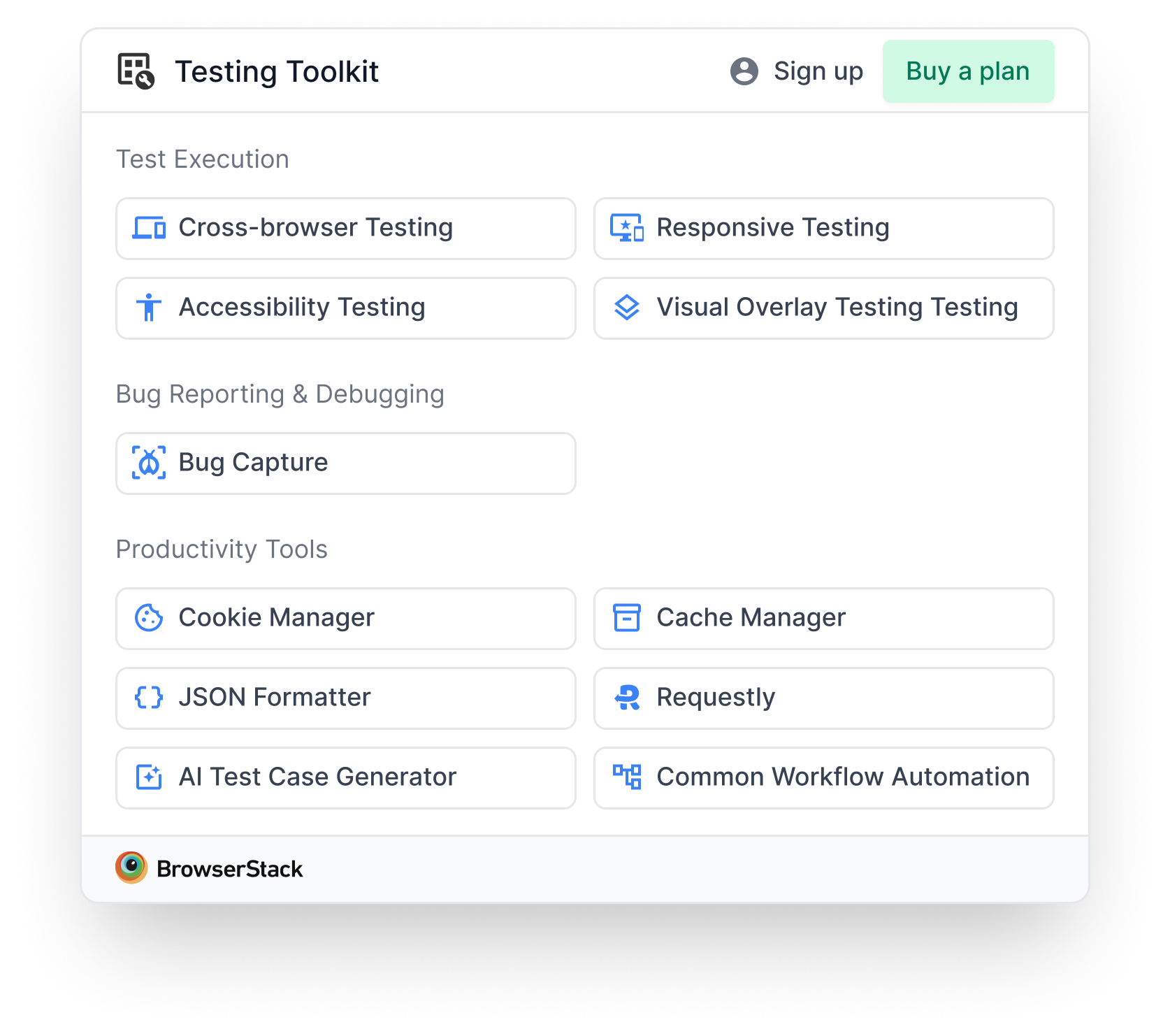
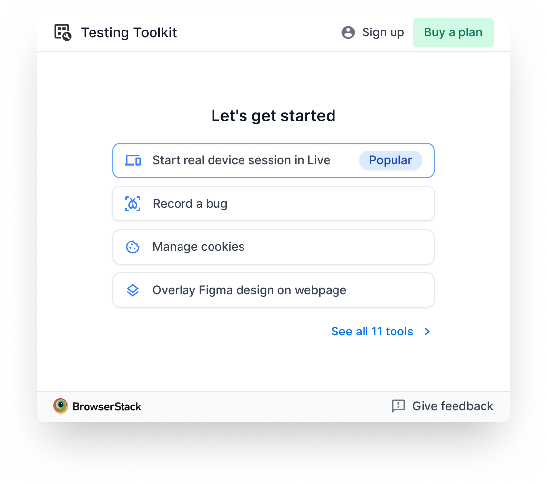
The home tray, shipped
What's there, and why:
- Categorised tool groups. The call from §1. Discovery over efficiency at MVP scale.
- 6 active tools + 4 Coming Soon. The call from §5. Momentum without vaporware.
- Gridlist XS components. The call from §4. Reusable extension scale, owned by Design Stack.
- BrowserStack logo as tool icon. Placeholder. Visual Design's functional icon set wasn't ready by Alpha, so I chose to ship with placeholders rather than slip. Real icons followed in the first post-Alpha drop.
What's deliberately absent (sequenced, not dropped):
- Quick actions. Sequenced post-discovery (§3).
- Personalisation. Sequenced post-15-tools (§1).
- Tool descriptions on the home tray. Added later as a separate screen for users who needed context before opening a tool (see post-Alpha section).
Cross-functional orchestration
Five teams, two weeks, one launch window. The orchestration was as much of the work as the design.
- Marketing, naming the extension. "Testing Toolkit" was the final after several rounds. I held the through-line: a name that read instantly to QAs without explanation, and that left room for Live to move inside later. Naming options that leaned on "BrowserStack-y" branding got pushed back for clarity.
- Visual Design, functional icons. Icons weren't ready by Alpha. I made the call to ship with the BrowserStack logo as placeholder and sequence the real icons into the first post-Alpha drop. The alternative was to slip the launch, which was a worse trade.
- Design Stack, extending the gridlist. Negotiated which variants belonged in the system (the XS scale, the two-column variant) vs. which were one-off. Outcome: a reusable XS pattern owned by them, not by my Figma file.
- Engineering, which 6 of 10. Worked with the lead engineer on the selection criteria above. The conversation moved from "what's hardest to cut" to "which 6 keep the story whole" the moment we framed criteria explicitly.
- Product + Research, the validation reroute. With external recruitment gone, I rescoped the validation through internal QAs in coordination with PM and Research, with a clear plan for external follow-up after Alpha.
What happened after Alpha
The layout held. Early signal (install rates, drop-off, reviews) validated the categorisation call. The home tray itself didn't change.
Onboarding and tool descriptions came back. Some tool names weren't self-explanatory (especially the more specialised utilities). Post-Alpha, I ran a deeper exploration of onboarding patterns: guided tours, tooltips, intro screens, use-case-based personalisation. We shipped a description screen for users who needed context before opening a tool. The home tray itself stayed clean. Descriptions live one level in.
An experiment that failed. We ran a variant showing only 4 tools as cards with descriptions instead of the full 10-tool list. Users loved the per-tool clarity but couldn't see what else was in the toolkit. Discovery suffered. We reverted to the home tray.
Personalisation is back on the table. The toolkit has grown, we have real usage data on which tools individual users actually touch, and the original 25+ tools horizon is in sight. The argument I deferred in §1 has the conditions it needed now. That's the next chapter.
What I'd do differently
- Test the layout assumption sooner. I argued for personalisation for the first half of week 1 before the Eng-capacity reality forced the switch. A 30-minute usability test on day one would have surfaced at 5 tools, categorisation wins faster than the design-review debate did, and without the credibility cost of changing direction mid-sprint.
- Line up external QA recruitment a week earlier. The internal fallback worked, but it carried bias I had to caveat in every review. Earlier recruitment would have removed that asterisk. This was the single follow-up I owned after launch.
- Spec the Coming Soon release windows tighter. I shipped "Coming Soon" without explicit per-tool release dates. The few reviews that flagged missing tools would have been muted if the answer was "this tool drops on X." A small copy decision with outsized post-launch impact.
Appendix: Research references
A condensed look at the products and patterns that informed the layout call. From the analysis, we pulled the features worth borrowing: collapsible views, category organization, quick actions, persistent visibility, state persistence, dynamic tabs, widgets.
| Product | Users / Rating | Reference | Insights |
|---|---|---|---|
| Stark Accessibility Checker | 10k users · 4.0★ | 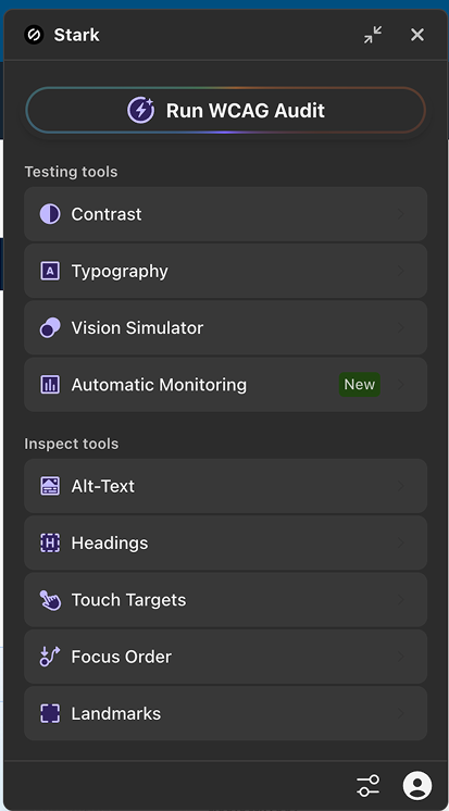  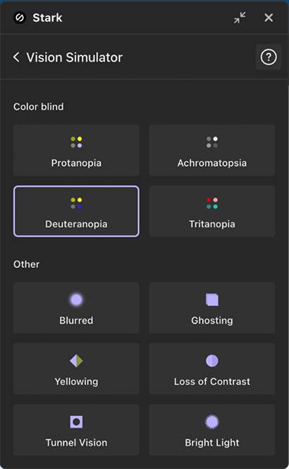 | Clear, structured layout. Simple list at L1, grid at L2. Prominent primary action (Run WCAG Audit). Collapsible view so the plugin lives on screen even when collapsed. Category organization with clearly defined groups. |
| SuperDev Pro | 1.6k users · 4.7★ | 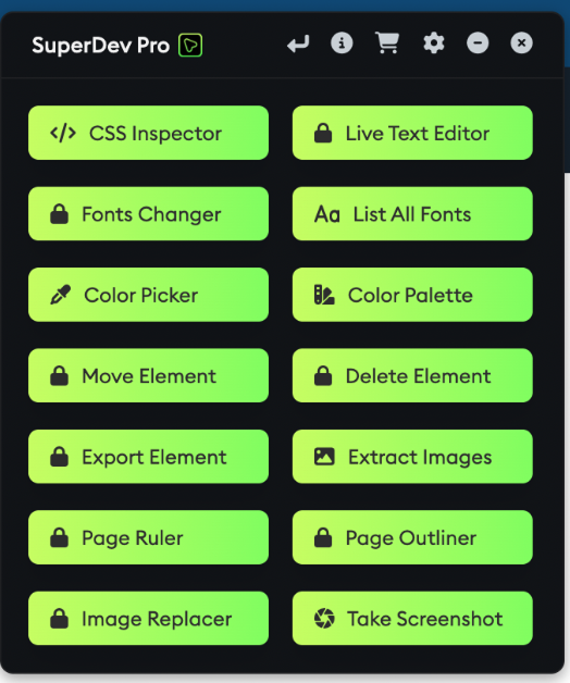  | Two-column list organises 14 tools in a small space. One-click main actions. Minimize/close flexibility. Consistent tray width. Paid tools shown as locked items with external redirect. |
| Small PDF | 1.3M users · 4.6★ | 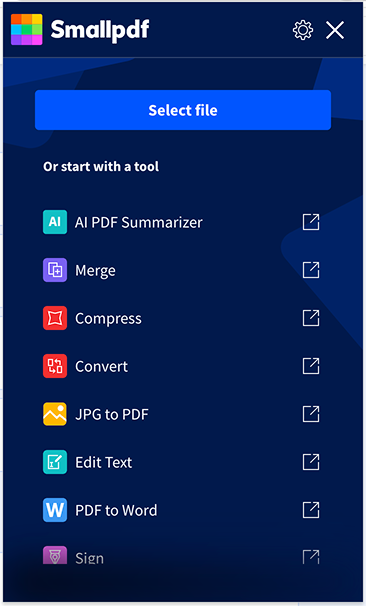 | Streamlined list layout. File upload is the only primary action. Each item is an external link. The plugin acts as a shortcut and does nothing on its own. |
| WebDeveloper | (no rating) | 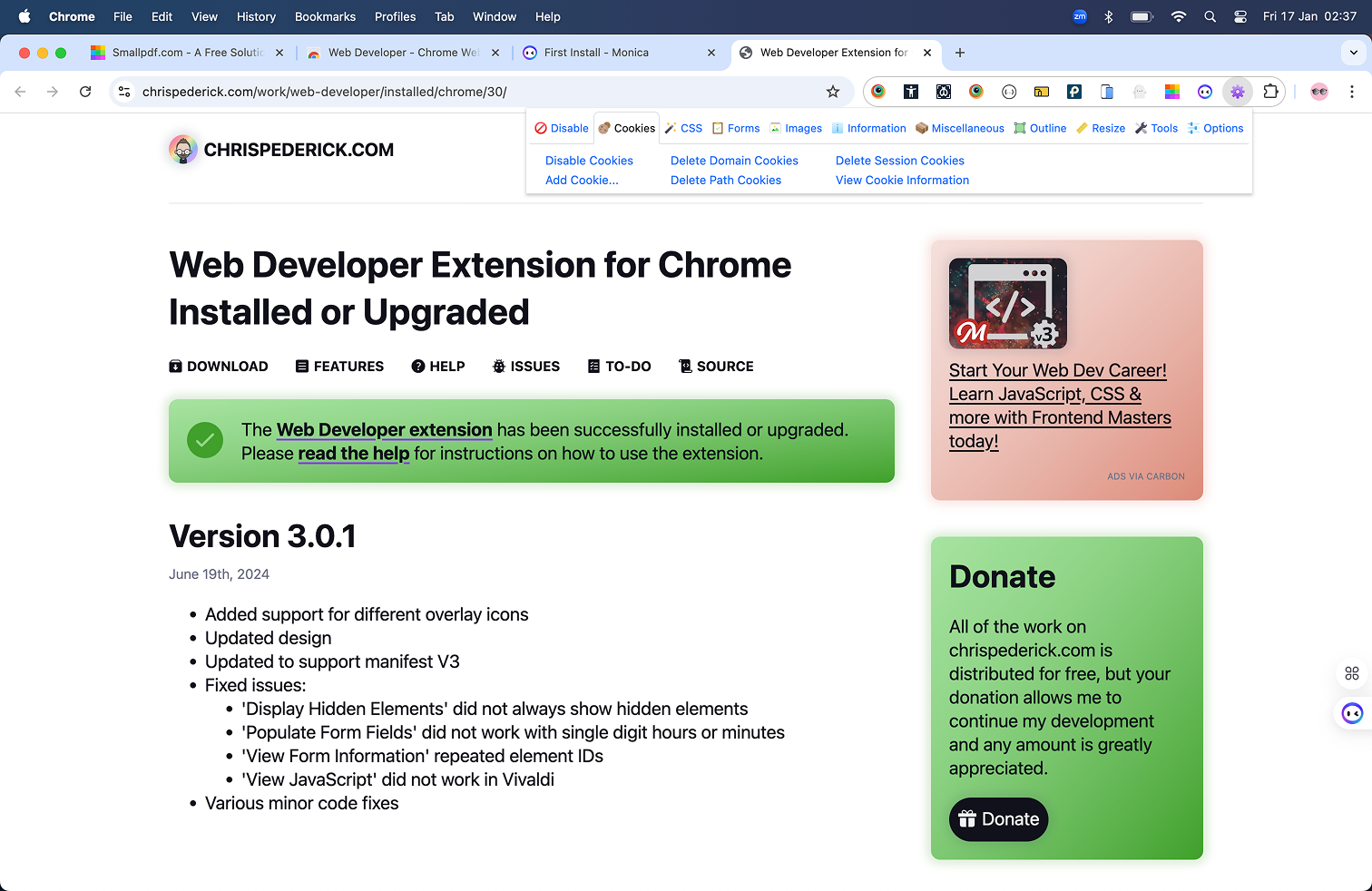 | Toolbar layout just below the main toolbar. Key actions upfront. State persistence so users don't lose progress, even after closing the plugin. |
| Site Inspector | 1.6k users · 4.8★ | 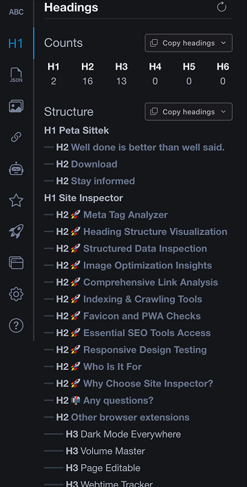 | Docked sidebar that stays fixed on screen. Always visible. Categorized list of additional tools. |
| SemRush SEO | 1k users · 5.0★ | 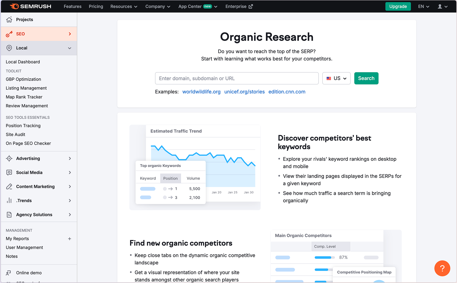 | Tabbed layout hosts all tools, switching between them. Some tools open in a dedicated web app environment. |
| Figma Desktop App | Layout reference | Home screen as overview. Second-level tabbed view, users choose which tab to open. Easy return-to-home. Dynamic tabs that can be added or closed. | |
| iOS Widgets | Layout reference | Widgets for one-click actions, performed directly from the interface without opening the app. |