Testing Toolkit, end-to-end
BrowserStack · Testing Toolkit • Lead designer, Strategy, DS, Design QA • 0→1 • 9 months
At a glance. Lead design on a Chrome extension at BrowserStack, end-to-end. From the originating conversation to GA in 6 months, with another 3 months of post-GA iteration. 20K+ installs within 6 months of GA. The strategic spine was the shortcut-on-ramp pattern, the toolkit as a fast front door to the broader testing platform rather than a competitor to it. Co-led the XS design system tier built in flight, now used across other BrowserStack extension surfaces. Some downstream metrics are NDA. Rising Star award (June 2025).
Impact
- 20K+ installs within 6 months of GA.
- Alpha in 1 month with 5 tools. GA at 6 months with 10. Still growing today.
- X lift on a downstream platform metric. Internal, available on request.
- X conversion from the toolkit to the broader platform, validating the on-ramp thesis. Internal, available on request.
- XS component framework co-built with Design Stack, now used across other extension surfaces.
- Rising Star award (June 2025) for this work.
The opportunity
QAs were stitching together browser plugins and extensions to do their daily testing work. Each utility lived somewhere different, and no competitor had built a unified home for them.
A product that did one specific job: be the QA's daily toolkit, in one place, with shortcuts to the rest of the testing platform built in. I led design on it end-to-end, from the originating conversation.
The strategic argument
Three bets in one product.
1. Meet QAs in the browser
A Chrome extension lives where QAs already test. One-click install, zero context switch, lowest-cost surface for a QA to try.
2. One home, not ten extensions
Replace the mishmash. One surface, consistent UI, the discoverability problem solved once. Each tool earns its place by being daily-useful, not nice-to-have.
3. The shortcut on-ramp
The toolkit doesn't compete with the broader BrowserStack platform, it shortcuts to it. A multi-step path to a Live session collapses to one click via saved device shortcuts. The same pattern extends to other BrowserStack products. This is why the toolkit can be the front door to the platform for QAs who don't already use it daily.
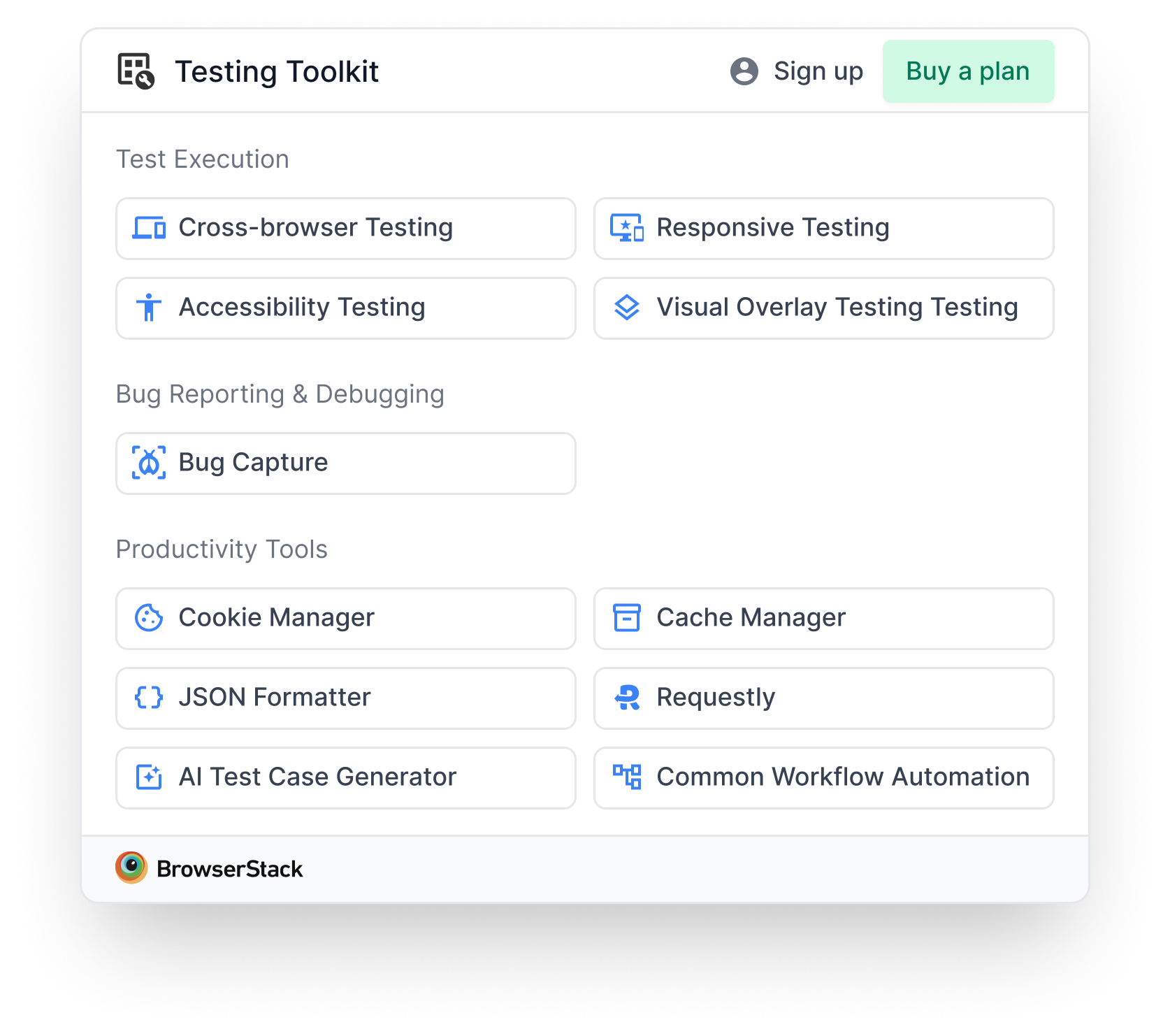
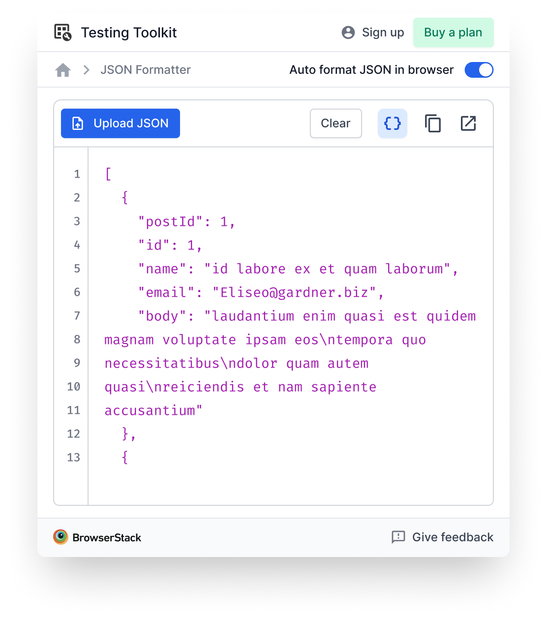
Some of what shipped
A flavour of the 10 tools at GA. Most are free, Live is the paid one.
What I owned strategically
I was lead designer from the originating conversation. The work was a real two-way conversation with PM, not "PM writes the brief, I design it." The strategic calls below are ones I either owned or co-owned:
- The shortcut-on-ramp pattern. How the toolkit connects to Live and to other BrowserStack tools without trying to replace them. This was the strategic spine of the product.
- Tool selection input. Initially there were no fixed briefs for individual tools. The list was an open conversation. I argued for some tools to be added and some to be cut based on QA workflow coverage and UI pattern reuse.
- Sequencing 5 then 10. What went in Alpha vs. what waited for GA, and why a phased release built more momentum than a single bigger launch.
- Chrome extension as the form factor. The argument for why an extension beats a desktop app, a web tool, or a browser-specific feature on adoption mechanics.
- The home tray. The first surface a user sees and the layout call that anchors discovery. (Covered in detail in its own case study.)
Scope and sequencing
A deliberately phased build, paced to ship momentum and learn between releases.
| Milestone | When | What |
|---|---|---|
| Alpha | 1 month from kickoff | 5 tools, Chrome Store launch |
| GA | 6 months from kickoff | 10 tools, broader availability |
| Today | ~9 months in | Still growing on a release cadence |
Hard strategic calls
1. Shortcut-on-ramp vs. standalone tools
Could have built every tool as standalone, competing with the broader BrowserStack platform. Picked complementary instead. Cost: the toolkit can't be the whole QA story. Win: no positioning fight with the products it shortcuts to.
2. Chrome extension vs. desktop app vs. web tool
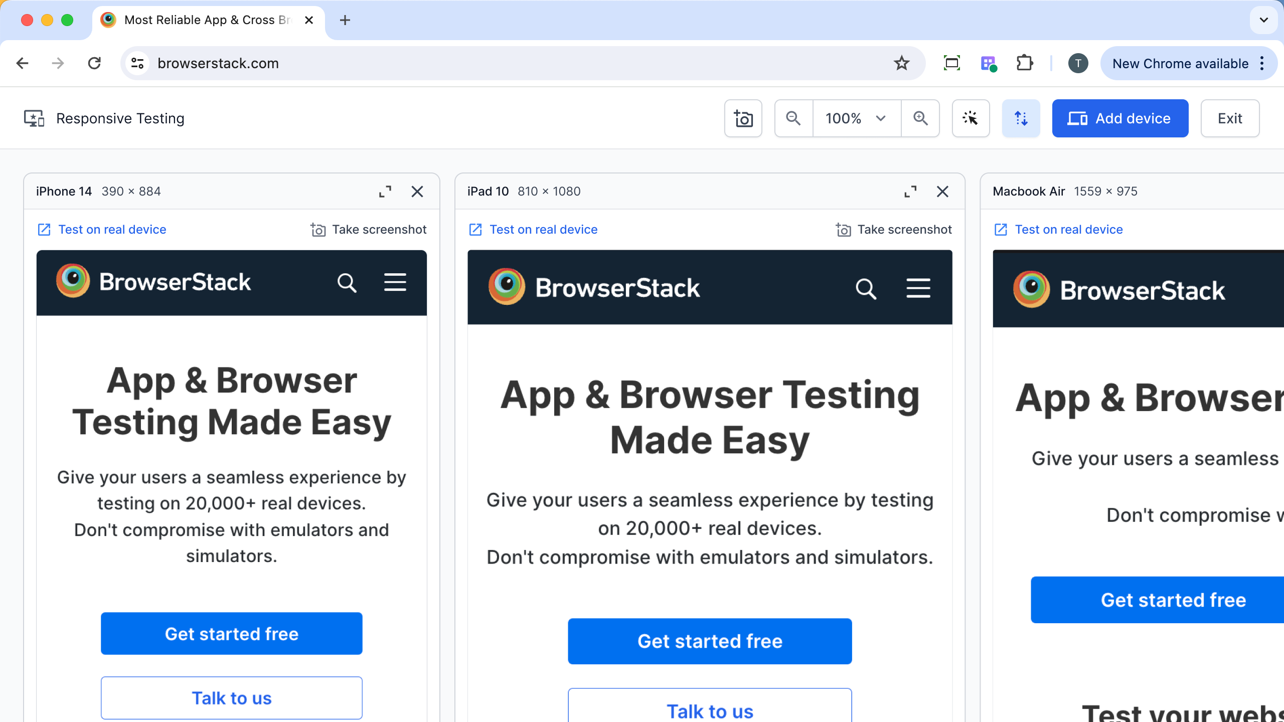
A desktop app would give more pixel real estate. A web tool would let us iterate faster. The extension won on adoption mechanics: one-click install, lives where QAs already test, auto-updates. The pixel constraint produced the XS gridlist pattern that now lives across other surfaces.
3. Tool selection logic
A market research study by the research team produced the selection logic for which tools went into Alpha and GA, and the prioritisation that followed. The criteria and the resulting list are internal. Available on request.
4. 5 at Alpha, 10 at GA, Coming Soon in between
Eng capacity capped Alpha at 5–6 tools. Hide the rest = thinner toolkit. Show all active = vaporware. Coming Soon at Day 1 with rough release windows = momentum without overpromise. Covered in detail in the home tray case study.
Three stories from the build
Three moments that taught me more about leading than any of the strategic decisions above.
The tool that didn't ship
One tool in the toolkit is still being scoped, and it's the one where I learned the most about working through ambiguity.
I picked it up with a single-sentence brief. The PM was running multiple workstreams and didn't have bandwidth to spec it deeper. I ideated against my best understanding and brought a first-pass set of designs to review.
The reception: the brief had moved. What had been described as a narrow utility (generate sample data for one specific test scenario) had broadened to something far bigger (automate any QA workflow). The first pass didn't fit because the target had shifted between briefing and review.
What I did in the moment: defended the design process honestly. I designed against what was communicated. The gap was upstream of design.
What the team is doing now: a fresh round of requirement-writing, an engineering deep-dive, more discovery. Months later, the right shape is still being figured out.
The lesson: with a one-sentence brief, the right move is rarely "ideate harder." It's to refuse to ideate until the brief is real. Saying "I need a clearer brief before I can design this" reads as friction in the moment and saves cycles in the aggregate. I'm still calibrating when to hold that line.
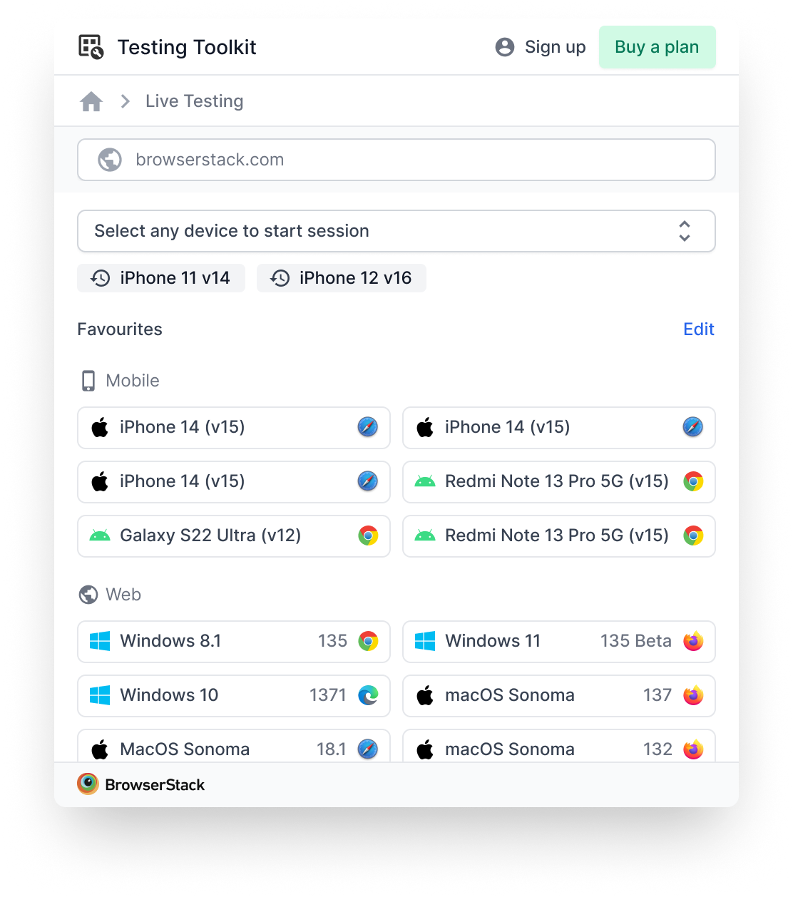
The Live shortcut that exceeded everything else
The tool I had the lowest expectations for was the one that exceeded them by the most.
The Live shortcut started as a convenience: open a Live session from anywhere in the browser without first navigating to the Live homepage. We knew it was useful. We didn't realise it would become one of the most-used surfaces in the toolkit.
What the signal told us, once we measured it:
- Users opened Live more often after they had the shortcut than before. The friction of the multi-step launch path was a bigger drag on usage than we'd modelled.
- Users started saving device shortcuts for their most-tested configurations, which converted "I'll get to Live later" into "I'll click this now."
What changed because of it:
- We expanded the surface to include richer Live capabilities (multi-device session launch, configuration shortcuts, deeper context-passing).
- We reframed how we talked about the toolkit internally. The Live shortcut wasn't just a feature, it was the clearest evidence the on-ramp thesis was working. It moved us from "the toolkit is utilities" to "the toolkit is a front door to the platform" in the team's shared language.
The lesson: when a feature exceeds your expectations meaningfully, the right move isn't to celebrate and move on. It's to expand the bet there. The Live shortcut is now where most of the post-GA growth investment goes.
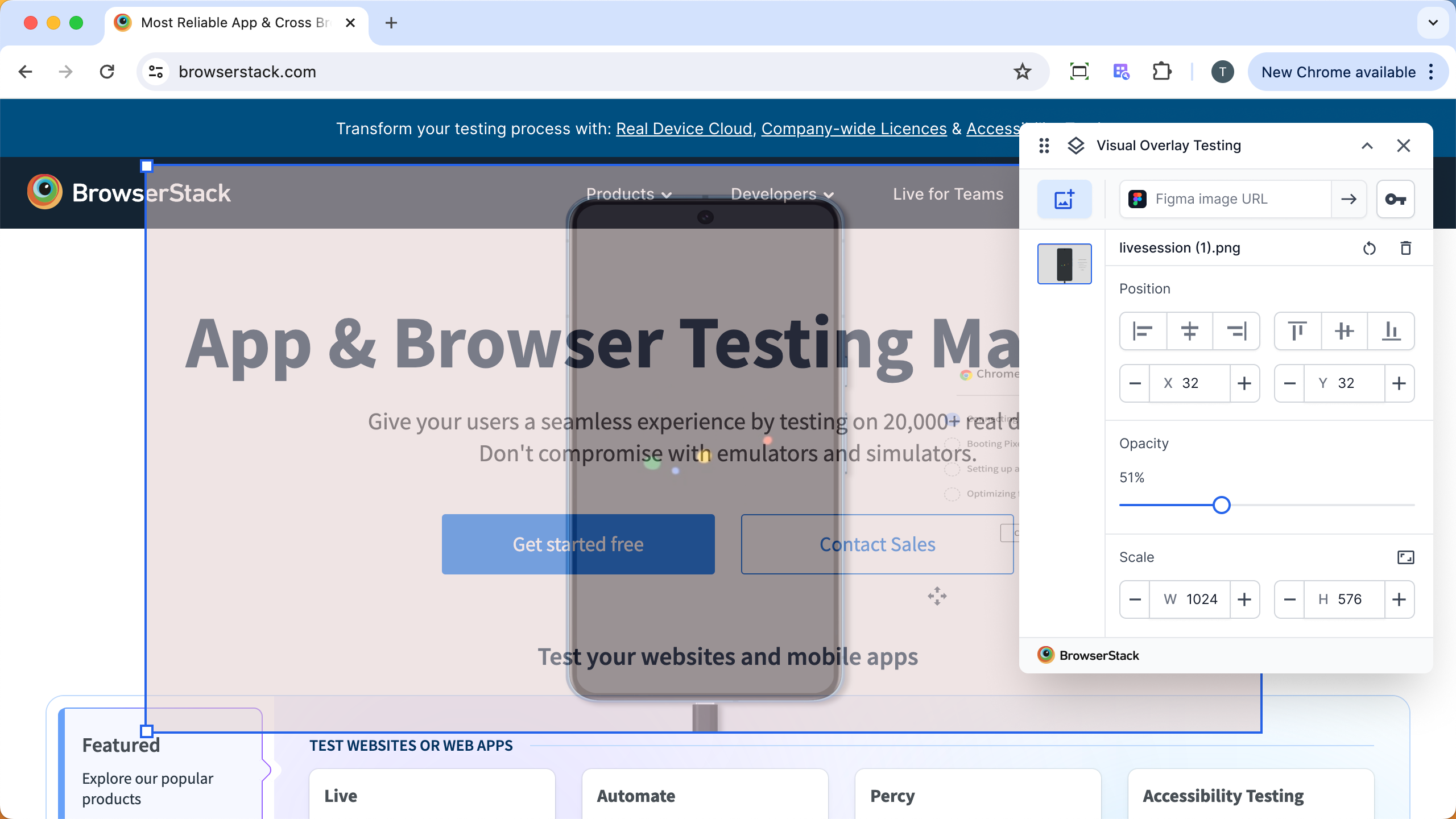
Building the XS design system in flight
The hardest cross-functional thread of the year, and the one that produced something that lives beyond this project.
The base BrowserStack design system was built for full-screen product surfaces. A toggle was 38px tall, headers were heavy, padding was generous. None of it fit a 400×600 Chrome extension with 10 tools inside it. And BrowserStack is accessibility-forward, so I couldn't just shrink things and hope.
The challenge: I needed components the design system didn't have yet, on a release cadence the design system couldn't match.
What I did:
- Named the pattern, not just the need. Not "I need smaller components" but "here's the systematic XS scale that multiple products are asking for." A Figma plugin team and other mainstream BrowserStack surfaces had the same need. I made the case as a system-level investment, not a one-off ask.
- Ran cross-stakeholder alignment. Brought the relevant product teams together to align on fonts, sizing, and behaviour. Ran smoke tests across surfaces (using Figma Make) to validate font choices and proportions before anything got committed.
- Composed from atoms while the system caught up. Where the XS scale didn't yet exist as official components, I assembled what I needed from the existing design system atoms and tokens. Nothing in my Figma file was one-off. The work still rolled up to the system.
- Contributed components back. Specs and explorations for components the system later absorbed into the official XS scale.
What lived beyond the project: the XS scale is now an official tier in the BrowserStack design system, used across multiple extension and constrained-canvas surfaces.
The lesson about leading: the system-level work compounds. A component shipped well into the design system gets used 100 times by 10 teams. A component shipped well into one product gets used once. Optimising for system-level contribution, especially when the system itself is forming, is one of the highest-leverage moves a lead designer can make.
Cross-functional orchestration
Strategic work in a 0→1 lives in the cross-functional alignment.
- Product. Two-way conversation on tool selection, sequencing, and the on-ramp thesis. Not PM-pushes-design-executes; design contributed strategic calls back into the product brief.
- Engineering. Worked with the lead engineer on which tools could ship per release based on capacity and UI pattern reuse (tools that shared patterns could ship 2-for-1).
- Research. Partnered on the market research study that informed tool selection (locked). Internal QA validation for Alpha-stage design calls when external recruitment wasn't ready.
- Design Stack. Co-led the development of the XS scale tier of the design system (covered in the story above).
- Marketing. Naming the extension ("Testing Toolkit" was the final after several rounds), positioning copy, and a release-by-release story.
- Visual Design. Functional icon set, sequenced into a first post-Alpha drop when the full set wasn't ready by Alpha.
Outcomes vs. the hypothesis
What we hypothesised vs. what happened.
- Hypothesis: a unified home would drive adoption. Outcome: 20K+ installs within 6 months of GA. Adoption beat expectations enough to accelerate GA scope.
- Hypothesis: the on-ramp would convert toolkit users into broader platform users. Outcome: the conversion showed up in the data; specific numbers are internal.
- Hypothesis: 5 tools at Alpha would feel meaningful rather than thin. Outcome: held, helped by the Coming Soon section. Day-1 reviews mostly engaged with what was there rather than what wasn't.
Specific downstream metrics (retention lift attributed to the toolkit, conversion rates from toolkit to other BrowserStack products, per-tool usage distribution) are internal. Available on request.
What I'd reframe today
If I were making the same strategic case from scratch with what I know now:
- Start with the on-ramp pattern, not the toolkit framing. The pitch I'd lead with today is "a faster front door to the testing platform" rather than "a toolkit of utilities." The on-ramp is the strategic spine; the toolkit is the form factor. Leading with the form factor put us in conversations about "which utilities" earlier than the conversations about "what does this product actually do for the platform."
- Pair Alpha with a usage-data plan from day one. We shipped Alpha and then sorted out what we'd measure. A pre-Alpha measurement plan would have let us evaluate the on-ramp thesis faster and feed it back into GA scope.
- Set the Coming Soon release windows in copy at launch. This came up in the home tray retrospective too, and it's the single highest-leverage copy decision we could have made for the launch story.